
Artist Website Design Inspiration
Nothing cheapens artwork like a lousy website.
There. I said it. You can quote me.
When they come to me, many of my artist clients know that their website isn’t serving their art as well as it should. Some of the “before” websites artists bring to me lack words, functionality, mobile-friendliness, story, and any discernible design.
Unfortunately, photos of your beautiful art slapped on a plain white website won’t translate as well as if they were hung on a pristine gallery wall in real life. Your website needs to be more than—pardon the pun—a blank canvas to sell to your potential patrons online. It needs to convey trust before people even consider investing in your work.
But I get it. You were born an artist, not a web designer. Art skills ≠ web design skills, right? However, it’s 2023, and more people than ever are engaging with businesses online—which is great—BUT, the stats are depressing—IF your website’s… ahem… “not great”.
These days, it’s not enough to have beautiful art to make it as an independent artist. When you’re selling aspirational (i.e., luxury) goods that cost hundreds or thousands of dollars through a screen, your website needs to hit the target right on the bullseye.
And while many elements make up a website (photography, messaging and copy, user experience, etc.), design matters most, or at least it matters first. Almost 75% of your website’s credibility relies on it.
I don’t want crappy web design to cost you sales or referrals. So I’ve rounded up some artist website design inspiration for you.
Let’s look at some of my favorite artist website design layouts I’ve created for my clients.
Just a quick note before you dive in… just as art copycats aren’t cool, neither are website copycats. If anything you see here resonates with you, take it as inspiration for your unique design, but please don’t copy.
And if you want a little piece of online heaven for your art, let’s talk.
Also, I invite you to click on the links to their websites when you’re done reading the article. Follow them on social media, cheer them on, and support them in any way you can. They’re amazing humans.

Statement Layouts
Statement section is my term for the scroll-stopping section of a web page that stands out among the rest. These types of sections work exceptionally well with bold images of art and lend themselves well to showcase the texture and color of the artwork. Gotta love those full-width images!
I love using statement sections as the homepage's first section to showcase what visitors can expect as soon as they land there.
In the example below, I used a statement layout as the very first section of Michele Poirier-Mozzone’s homepage. I had the pleasure of working with Michele on a Website in a Week to create her entire website, copy, and brand. She can swap out the image based on her new paintings or collections and give her homepage a refreshed look.
Notice the subtle dark gradient behind the top navigation, which gives the text plenty of contrast without getting in the way of the image.

I used a statement layout on Ksenija Simmons Studio’s website with minimal text atop every web page. This helped us feature her beautiful photographs and highlight the specially coded scrolling navigation, which rises to the top as you scroll down the page.
I adore this layout for artists whose art consists of beautiful textures or who have great website photos.
Ksenija’s website was one of the most—if not THE MOST—complex websites I’ve ever developed in terms of coding. Still, you’ll see how it effortlessly suits her curated maximalist vibe and her exceptional eye for color. I had plenty of time to code these beautiful effects because we worked on her branding, copy, and site on my signature service, The Liberated Artist Blueprint™.

Speaking of texture, pop into brilliant artist Robin Davisson’s website—one of my favorite Liberated Artist Blueprint™ grads ever—to see just how her art and copy take center stage. Sweeping fields of complex colorful layers play off beautifully with the details of the large text and brand elements.

Negative Space Layouts
Negative space is one of my favorite web design tools. It refers to the blank space between the website elements. It lends breathability and spotlights the art or a message in a way that allows the site visitor to drink it all in.
Negative space provides the eye a break and contrasts with busier sections such as the statement layouts mentioned above.
In the example below, belonging to North Downs’ artist, Sophie Taylor, you’ll see how the text has plenty of room to shine. Using crops from her textured artwork allowed me to frame the text while featuring the luscious layers of her work. Sophie has a strong sensibility to how art transforms a space's energy. So I used plenty of negative space layouts throughout her website to highlight in two dimensions how her art elevates and changes a three-dimensional space.

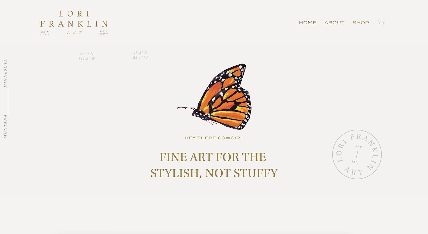
The following example is taken from the artist website of Lori Franklin. I had the pleasure of designing Lori’s branding, writing her entire website copy, and designing her beautiful site during our Liberated Artist Blueprint™ project. Lori’s art is vibrant and playful, with endless moments to discover. I used negative space layouts to help her art pop off the screen. Note how each element is uncluttered, yet there’s still plenty to explore.
Video Layouts
A well-shot video can do wonders to entice site visitors into your story. I’ve designed a few websites that feature videos, and NYC artist Rachael Ryan’s is one of my favorites. Click play below and let yourself sink into Rachael’s stylish, artistic, and cozy studio vibe.
Right off the bat, without reading a single word, you’ll be immersed in Rachael’s chic and soulful world.
Another great video layout is the one below from artist Sophie Taylor’s website. This layout features a video on the right-hand side which automatically loops. Click play on the video below to see it in action.
This understated surprise took a bit of clever coding to create, but it was worth it to show off Sophie’s dramatic landscapes in the South Downs while also nurturing a sense of quiet awe.
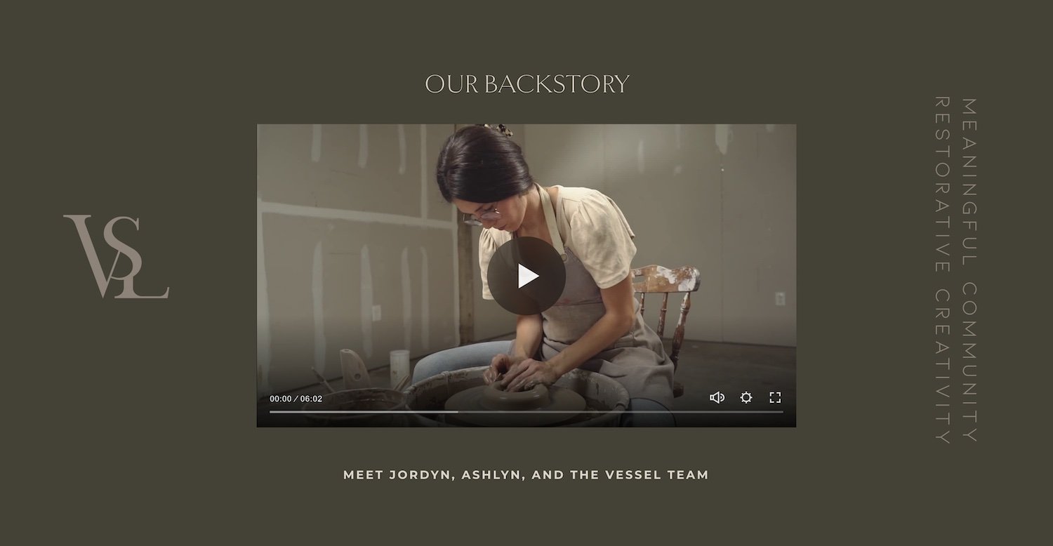
I had the pleasure of working with ceramic artist Jordyn Brummett for a second time on a Website in a Week project for her community ceramic studio in Alabama, The Vessel.
The project features extensive video layouts throughout, as shown in the following two examples. The first layout is of a beautifully-produced video showcasing The Vessel's story as told by Jordyn. Autoplay videos wouldn’t work here because this video features sound. Notice how the minimal video player entices people to click and watch the story while branding elements add a bit of texture to the moody section.
In the second example, I decided to use one of Jordyn’s wheel-throwing videos in the background in a section speaking about the nurturing studio experience. Click play to see it in action. In this kind of layout, with text featured on top of it, the video is used as a textural storytelling tool.
Organizational Layouts
Nothing thrills me more than creating calm out of chaos. Give it time, and every artist's website will eventually accumulate more and more distinct elements that make it hard to keep organized in a user-friendly manner. This was a challenge artist and educator Louise Fletcher brought to me when we worked together on The Liberated Artist Blueprint™. Not only did she have multiple types of offers, but she also had two audiences—each with distinct interests and needs. Multiple mentorship sessions allowed us to define her overarching message and bring both audiences under the same roof.
While I employed several layered strategies to keep things organized and simple for the user, the section below, featured on her homepage, helps site visitors self-segment. Note how the negative space of the photo helps the buttons stand out.
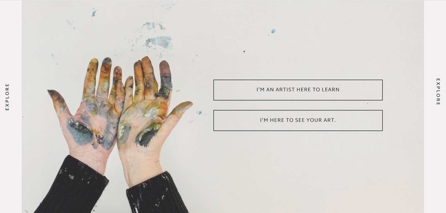
The “Choose Your Own Adventure” layout is one of my go-to section to serve up important links that invite site visitors to keep exploring. Besides keeping content organized, they also work to showcase the most important web pages on a site and to help them find the content that’s most relevant to them.
The example below is from D.C. artist Robin Davisson, who has a bustling studio in Georgetown.

Below is a similar layout that helps feature the art and organize the content of portrait artist and storyteller extraordinaire Jessica Cook’s website. During The Liberated Artist Blueprint™, besides writing and designing her site, I had the pleasure of creating Jessica’s branding, which included the spot illustrations that crown each option.

Another organizational layout that’s quite important is the footer navigation. If the top navigation needs to be streamlined and focused on the most important pages, the footer nav is where ALL of the links can be found.
Check out this super-organized footer from The Vessel Community Ceramic Studio’s website. I’m quite proud of this one and I think Marie Kondo would be proud.

Symmetrical and Balanced Layouts
Composition is a great tool to use when laying out a website. Symmetry and balance help organize content and give a website a designer feel. And the good thing is that there are many ways to achieve them.
In the first example from Kate Sondag’s artist website, you’ll see how I used these three photos to give a sense of order and calm while keeping things interesting.

On Australian artist Natalie Eslick’s website, I used symmetry to contrast with the wild natural beauty of her work and photography. We arrived at this design choice through the multiple mentorship sessions we had as part of The Liberated Artist Blueprint™.
These half-and-half layouts highlight the content and make the website easy to navigate. As a brilliant, multi-faceted artist and writer, it was important for the design to let words and images shine without competing, and this kind of layout allowed us to achieve that.
Swing by Natalie’s website and join her newsletter if you’re into exquisite details and writing that’s deep, sensory, and heartfelt.

Ben Seaman’s artist website also features balanced layouts against a neutral background. This allows the specially coded scrolling effects to have a more significant impact as it showcases his work.
Swing by his website if you’d love to witness an artist’s exploration of humanity through color mastery.

A little bonus designer tip
Below is another example from Ben’s website which I wanted to feature because I’m using the portrait’s sightline to guide the viewer to the text. Remember, when laying out your images, make sure all of your figures’ lines of sight lead to the front or inward towards the vertical center of your site.

Featured Illustration Layouts
One of my favorite things about working with so many artists is the variety of imagery that I get to play around with. Rather than getting bored to death using stock images to design websites, I get to work with beautiful artistic elements created by my clients.
When appropriate, I love bringing these elements out of the art and onto the screen.
Take a look at Ksenija’s animated homepage header by clicking play below. See how her illustrated florals move to reveal her logo. It took countless hours to get this effect specially coded for her website, but in the end, the results were magical and help showcase her artistic style.
I had the pleasure of writing and designing the website for artist and educator Victoria Johnson who creates brilliant illustrations using collage and paint. As a surface designer, I had lots of fun illustrations to pop into the margins of her site, not only spotlighting her work, but also helping lead the eye around the page.

Designing the website for Liberated Artist Blueprint™ client and friend Moneeza Khan’s Lotus Blu Book Art was a great pleasure. Moneeza has a solid artistic voice inspired by her heritage and a keen eye for soulful beauty. She also has gorgeous photos which showcase her book creations. Fellow bibliophiles—you’re welcome.
Click on the video below to watch how the specially coded arrows add charm to this scrolling block and take a look at the sketchy botanical leading the eye right to the good stuff.
In the following example, a screenshot from Robin Davisson’s website, I utilize a branding element to lead the eye to the text and create a bit of balance.
I love creating distinct branding elements for my clients, which can help to grow brand awareness and promote trust.
Mini-Bio Layouts
The mini-bio section is the homepage precursor to the about page. It’s the section I love using on every client website to give a brief intro to the artist and invite them to discover more on their about page.
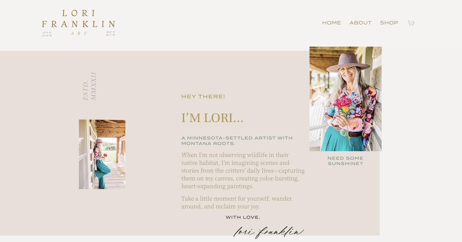
The charming example below is from Lori Franklin’s artist website. Soft layers, font hierarchy, and subtle branding hints let her images (and that gorgeous smile—are you kidding me?) pop.
On encaustic genius Whitney Luallen’s artist website, we utilized soft washes of color, bold typography, and sassy copy to invite people to click on her about page. I can’t get over the beauty that comes out of Whitney’s studio and how she creates gorgeous nature-based abstracts using pigment, wax, and fire!

I had to return to Natalie’s website and share this gorgeously textured bio section with you. You’ll see how the design of this section strengthens the message behind Natalie’s ethos. Purely divine.
Notice how Natalie’s sight line draws you to the text.

Visual Storytelling Layouts
Integral to your website, storytelling layouts can take many shapes and forms. I love using these layouts to feature fun facts, timelines, scrumptious process details, or studio images for my clients.
Below you’ll see an excerpt from Sophie Taylor’s website featuring font hierarchy and a series of studio images that help anchor the story and give it color in her site visitors’ imaginations.

The image below features one of my favorite fun fact sections that I’ve designed for Whitney. Layered. Fun. And full of personality.

For Ksenija’s website, the polaroid-inspired image borders give this layout an approachable feel and help the colors stand out against that french blue. It took a bit of coding, but the effect suits her vision beautifully.

Anne Mavor’s journey is full of beautiful twists and turns that formed her into the artist she is today. It was important to honor her path and multi-disciplinary approach to exploring art. From performance art, to writing, installations, and painting, Anne has done it all. I created this timeline to tell the highlights of her artistic story on her website.

I hope these layouts inspire you to make your website THE PERFECT home for your art online. Remember, a website is never truly “finished” but rather, it should evolve alongside you. If you need support along the way, I can meet you where you are and help you sell your art online in a way that’s aligned with your values and fires you up.
If you liked what you read and haven’t done so already, check out…

The Prolific & Profitable Artist™ Quiz
Assess your marketing prowess, learn about your superpowers, and get a personalized plan to get your art seen & sold.