
Artist Websites: 6 Must-Haves for Every Artist

I imagine there are some non-artist business owners out there who just don’t overthink what they do with their website. Perhaps they find a nice template (one that’s built with the average business owner in mind), throw some photos up, and call it a day without looking back. In their book, it’s done!
But I couldn’t do that, and I'd like to guess that you wouldn’t be comfortable doing that either. Simply because we’re artists! We pour so much of our heart into what we do. And our websites need to showcase and reflect our visual work in a way that makes the visitor feel the feels while also reaching for their wallet.
It’s a delicate balance. But it’s that balance that makes so many artists hesitant to finally build and launch their website.
You want to make sure you get it right. You want to be proud to put your website on a card or send someone your portfolio. You want it to be the real you and not the version that’s modified and stuffed into an average template.
Unfortunately, having an eye for aesthetics doesn’t necessarily translate to building an effective website. Things like user experience, search engine optimization, and conversion elements all come into play.
I want to help make sure that those days you spend building your website, are days that are moving the needle forward for your business.
So here are 6 must-haves for artist websites that will not only help you feel represented but also propel your business forward.
1. A streamlined top navigation
Think of your navigation as the ushers at your favorite concert (hey T-swift!) They’re making sure your audience receives the most relevant information and takes the right steps to get to where they want to go (i.e. shop, commissions, about page etc.).
Like an usher, your navigation should make it easy for them to find what they need and show them how to get there as quickly as possible. And because your site visitor has more than one action to take, it’s important to not overwhelm them or they might leave.
Here are some things to keep in mind as you create your top navigation:
Don’t use drop-down menus.
While you may be drawn to using drop-down menus (lots of people are), they’re actually more trouble than they are worth. On both mobile and desktop, drop-down menus give the reader ample opportunity to skip over key pages. Having a horizontal menu is much easier on the eyes and more likely to keep readers on track.
Double-check your links.
There’s nothing more frustrating to a site visitor than tapping on a link that goes nowhere. Make sure to double-check that every one of your links is directing viewers to the necessary page and that any pages that take people off your site are opening up in a new tab!
2. Create copy that speaks for you.
There’s a misconception that when you start a website, as an artist, your artwork should speak for itself and negate the need for much copy.
….I wholeheartedly disagree.
Don’t get me wrong, a piece of artwork absolutely can speak for itself. But that's more so if the viewer was only in the mindset of understanding and taking in your art (like at a gallery show). But on your website, your artwork is going to be competing with many other distractions such as other browser tabs, cellphones, and people’s attention span.
So it’s imperative that you have words on your website that tell people about your artwork in a way that's really interesting, compelling, and relevant.
As an artist, I understand that you may feel very shy writing about your work or feel awkward talking about it—we all do, trust me—but your website is the one place that you really, really, really need to jump over the fear and do it anyway.
Talk about the inspiration behind a piece! Talk about your process. Talk about anything you feel is relevant to the visitor understanding your work. And while you’re at it...talk about you too. I’m not saying you have to have a fully-fledged “about me” section, but a well-written About page could do wonders when it comes to further deepen the connection with your audience.
Keep in mind that while copy on your website is necessary, you’ll also need to keep the delicate balance between talking about yourself and what you can offer your audience. This will be your corner of the Internet, but the focus should not be solely on you.
Your job is to write about your story and your work in words that resonate with your ideal buyer. Make the information relevant to them and use the words they would use as a way to make that connection.
If your copy isn’t relevant to the site visitor, then they’ll be closing out the tab before you know it. Go beyond just engaging website content. Show the reader why they should care about you and your work by using your words to make a connection. And get rid of anything that’s not relevant to that goal.
3. Use a hierarchy of fonts.
Another way to keep the attention of your site viewers (and the attention of search engines like Google) is to acknowledge and implement hierarchy in your fonts. This is done by making use of headings, subheadings, and paragraphs in the correct order and not switching back and forth between them erratically.
Your headings and subheadings should be strategically used to create relevant sections on the page that help your viewer navigate or scan without getting confused. Make sure that these headings and subheadings are specific and detailed enough to give skimmers a good idea of what’s in the section.
In terms of hierarchy, the title will be your H1. Any headings afterward will be H2, H3, H4, etc. If you want to dive deeper into headings, here’s a great primer on how to use headings for SEO on your site.
Here’s an example of a page with no hierarchy and one with effective use of headings:
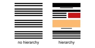
The page on the left with uniform text will not only be difficult to scan quickly but also difficult to read. The amount of text becomes overwhelming with no headings to break it up. However, the page on the right visually breaks up the text, making it easier to consume.
Additionally, it’s important to note that relevant, strategic headings will make search engines more likely to find your pages! Just make sure that you're using any keywords relevant to the page topic in the headings.
4. Use professional photos...that don’t look “professional.”
As beautiful as your artwork is, there are other pictures that need to go up on your site too… Photos of you!
Your viewers want to be able to put a name to a face and connect with your work and messaging on a deeper level. And the only way they’re able to do this is by seeing you.
But not the stuffy posed you with your arms folded or your chin resting on your fist. (You know what I’m talking about…)
While professional, your website photos also need to be inviting but also reflective of who you are. Instead of hiring a corporate headshot photographer, try to find a lifestyle photographer instead—one who can help you tell your story and communicate who you are through your photos.
By incorporating these personal (but professional) photos, you’re helping make things more memorable for your audience, which makes them more likely to remember you and your work when they’re ready to buy.
Of course, when it comes to the artwork itself, you’ll want to have professional photos taken of your work as well. This ensures that your work is being shown in the way you want people to see it.
If you’re not ready to invest in professional photography, you can take high-quality photos yourself. With a little practice, you’ll be able to showcase your work in the best way possible.
*Warning: when it comes to displaying your artwork on your website, be wary of sites that offer mockups. There are some mockup apps that can look really bad, cheapen the website, and lower the visual value of your work. And we don’t want that! Instead, seek out higher-quality mockups or try making your own by taking some reusable shots!
5. Include calls to action!
Your website is far from complete if you don’t have effective calls to action embedded throughout your pages.
While it’s easy to do a simple “contact” or “buy” button, those rarely get you that click you’re looking for. Instead, you want to make your calls to action pop by using copy that makes it compelling enough to click. Start with a vibrant verb that isn’t overused. For example, instead of “buy now,” you might say “snag your copy.”
You can also increase the likelihood of visitors clicking by prominently placing your buttons at the very top of your web pages so that viewers don't have to scroll without knowing what action you want them to take.
I will warn you that you don’t want to go overboard though. Too much of something can also be a bad thing! (Except when it comes to tacos.) Avoid using too many calls to action or buttons that detract from the messaging on your page.
Finally, make sure to end every page on your site with a call to action. While your first inclination may be to leave off the CTA on a page like you’re About page, you can still invite the visitor to do something worthwhile like sign up for your email list or check out your portfolio.
The sky’s the limit so don’t put a ceiling over yourself.
6. Don’t neglect your footer.
Last, but certainly not least, is the footer.
It’s the underdog that everyone loves to forget, but it's my favorite element to remember!
Your footer is what grounds your website. While business owners often neglect to take care of their footer, I see it as a way to give your viewers even more information.
Getting to the footer of your website gives your viewer the feeling of “Oh! I made it to the end.” So why not give them a good parting gift? Here you can include all the other links that you may have wanted to put in the navigation bar but knew were not necessarily crucial need-to-know things in your business.
Your footer can include things like your newsletter signup, a refresh of all the links in the navigation, a variation of your logo, more copy that tells people about you, or anything else you’d like them to know! This is the best spot to send them off with a kiss and a hug. (Or a well-masked elbow bump.)
As a fellow artist, I understand the importance of your website representing both you and your work while also moving the needle forward in your business. By implementing these 6 key must-haves for artist websites, you’ll be covering both bases!
But if these must-haves did nothing more than make you realize that you don’t actually want to build your own website, remember that DIY is not your only option! I'd be honored to take care of your branding, copywriting, and website design... in a week no less!